Pause for thought
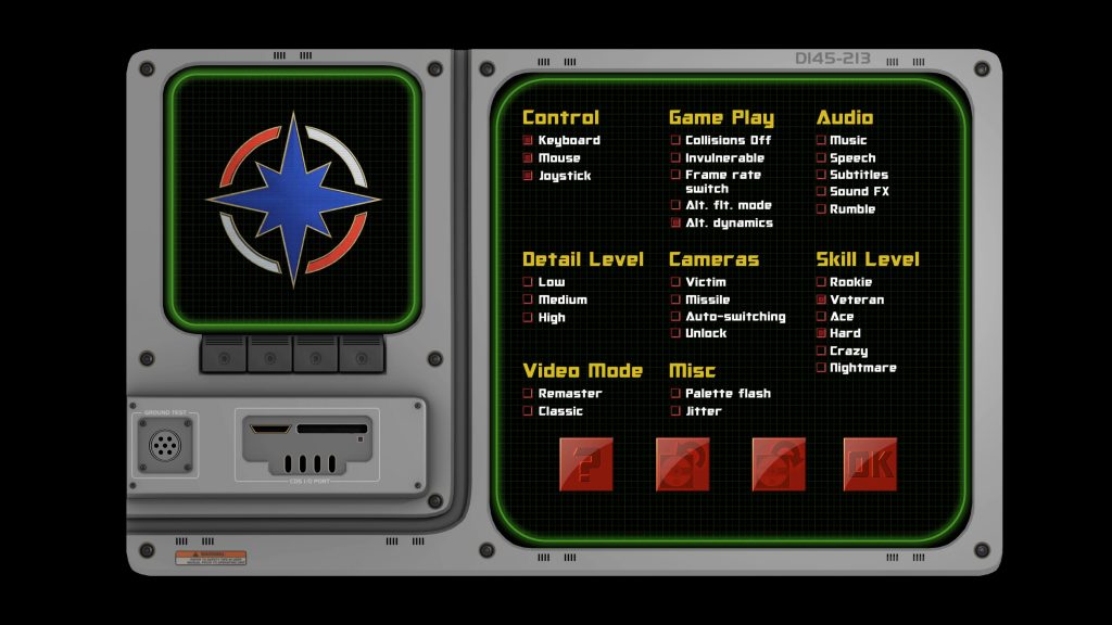

Now we’re ramping up towards releasing our first playable demo next year, our thoughts are turning towards the more mundane elements of the game. It can’t all be flight engine and sexy HD videos.
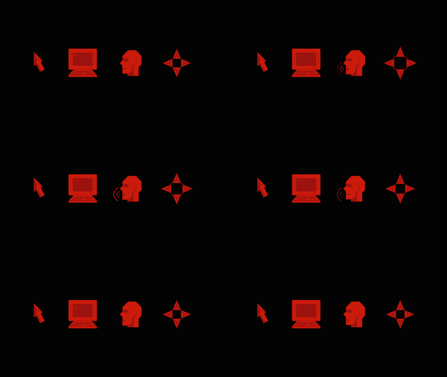
As such, Pedro tasked me with overhauling the game’s pause menu, in a similar vein to the redesign I already did for the game’s mouse cursors.

I thought it might be helpful for him to have an aesthetically functional prototype to work from, so he can see how I envisage it all laid out and how the UI animations could work. As such, I put together this online demo – which we’re now making available for you to see!
A few points worth noting:
- This is a first-pass design and will be subject to change as the project demands.
- It’s intended purely as an aesthetic example of how the menu should lay out and animate.
- The Confed emblem animation in the left corner screen is just set dressing. We intend for this screen to hold navigation to other menus in the final game.
- Props to Defiance Industries for modelling the cockpit screen that contains the menu!
- Since this menu is intended for the game, it’s geared towards desktop screens and TVs – and as such, this demo won’t work on mobile devices. I’ve actually put a blocker in place to prevent anyone seeing it all messed up on phones, so you will need to view it on a computer.
- I have, however, built it in such a way that it should scale gracefully to different monitor sizes/resolutions, just as it would in-game.
- It might work on tablets – but then you’re missing out on all the fun mouse cursor interactions and animations!
As always, we welcome your feedback. Do let us know what you think over at the CIC Forums.
